Just take a look at this great shot of Johnny Unitas:

This was the photo used for card # 57:

I really like this picture as it shows so much of the action from the play as opposed to a tightly cropped shot of just one player. Even though you can't see the receiver that Unitas is throwing to, you can see the pressure on him to get the pass off in a hurry. You also get 3 refs in one shot which is something you don't see too often.
And how about a shot of Jim Brown running against the Giants:

This picture appeared on card # 77 (where Topps refers to him as Jimmy):

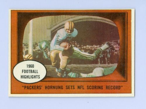
Here is Paul Hornung against the Eagles at Franklin Field

which was used for card # 38:
This picture of Eddie LeBaron

was used on card # 19 denoting the 1960 inaugural season of the Dallas Cowboys:

Here is Charley Conerly of the Giants against the Steelers back when the Steelers wore numbers on their helmets

which appeared on card # 94

Speaking of the Steelers, here is Bobby Layne

which was used for card # 113

Here is Milt Plum of the Browns in what appears to be a night game

which was used on card # 132

These photos and the 1961 cards show that Topps had the ability to produce cards with excellent action shots by the early 1960s. They continued featuring action shots on their 1962 Football cards with B&W action shots beside a color portrait:

But after that, action shots virtually disappeared. Why didn't Topps feature action shots in either baseball or football sets on a regular basis (other than the occasional action shot on a World Series card) until almost a decade later, when they started including action shots in the 1971 baseball set
 and in 1972 for their Football set:
Taking a look at the 1972 "In Action" cards, I'd have to say the 1961 cards look much better in terms of the action they portray. The airbrushing just kills any kind of sense of action that the picture conveys because it doesn't look real. Speaking of the 1972 action shots not looking real, what is going on in this picture?

Apparently the ball has some kind of force field around it which causes everything around it to become blurry. Since you can see the feet of the players below the blur, I'm guessing Topps must not have had the rights to someone on the bench so it looks like they tried to make them disappear.
After seeing these negatives and finding the 1961 cards that were produced using those pictures, it really seems a shame that Topps didn't include any action photography in their football sets for 10 years, and instead put out cards that looked like this:


Just think how much better these sets could have been had they included some action shots. After seeing what Topps was able to do in 1961, there is no reason why they could not have had at least a few game photographs in their sets each year.
It wasn't until 1976 when Fleer issued their first Team Action set that we saw cards that depicted NFL action in a similar fashion to those 1961 cards since Fleer didn't have to airbrush the logos:

It seems like in some ways those 1961 "Highlight" cards were ahead of their time with their use of game action photographs since it would be quite awhile until collectors would once again find these types of action shots included in their sets.


-29.jpg)


1 comment:
At least for the NFL - Topps appears to have a logo issue (Topps did not want to pay for the use of the logos)
It appears in 1968 and 1969 Topps used NFL official logos on their cards they really didn't - Take a closer look.
Some were very very similar but they were not the exact trademark logo's for the teams.
The closet I could find would be the logo on the 1969 Pittsburgh Steelers cards - However the Steelers logo colors are Yellow, Orange and Blue - the colors on the Topps cards are Yellow, Red, Blue - I don't think this would pass in a court of law today but.....back then they survived until 1970 (when the helmets disappeared from the players head)
Post a Comment