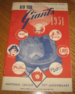

Just like the AL was celebrating its anniversary (50 years), the National League was celebrating its 75th anniversary in 1951. It appears the milestone anniversaries were the reasons why the Yankees and Red Sox programs were similar to each other, and why the Giants and Dodgers are very similar in design as well.
Taking a look at the logos, the Giants logo is the one they used until the early 1980's

when it was replaced by this

which has evolved into the current logo:

The Dodgers logo really hasn't changed much:

other than adding a few more red lines and changing the script slightly:

Even though both the Giants and Dodgers moved from New York to California in 1958, neither team made significant changes to their logos.
The Phillies are back to using a similar script to what they had in 1951

 after having changed their style to this for during the 1970s & 1980s:
The Cardinals continue to utilize a logo featuring 2 Cardinals on a bat:


The Cubs logo is still almost the same

with the main difference being that the logo now has a blue circle around it

The Reds logo also hasn't changed significantly


as the team changed back to having the name Reds inside the "C" instead of Mr. Red who appeared inside the "C" from the early 1970's until the early 1990's:

The Braves and the Pirates are the two teams whose current logos don't really look much at all like they did back in 1951.
The Braves have moved twice since they were in Boston in 1951, first moving to Milwaukee in 1953, and then Atlanta in 1966. During that time, their logo has changed from an Indian chief with a full headdress

to a single feather

to a logo that features a Tomahawk:

The Pirates have gone through a number of different buccaneers since this fellow appeared

starting with this logo in the 1950's

which then changed to this in 1960:

In 1968, the Pirates switched to this logo

which remained until 1987 when it was replaced by this:

Finally, in 1997 the team changed again to the logo that is still being used today:

Its interesting to see that some team logos have not really changed much over the last 60 years, while in some cases teams made changes and have since come back to a similar design.


No comments:
Post a Comment